Silver Drop is a silver gray, Ocean Pearl is a green-y gray and Krypton is a blue gray. I'm liking gray at the moment. It's neutral without being boring and it's soothing. I have far too much drama in my life to have to look at crazy paint colors, so that's what works for me.
However, when it came time to paint our bedroom, Drew wanted to shake it up. He wanted the bedroom to be different than the rest of the house with a little more intensity. So why not shake things up? This the first
So we went bold with the bedroom color. And I'm scared. I'm not sure what to think of it yet and I'm hoping y'all will help me. But please remember this is my first time, so go easy on me.
I still wanted to stick with earthy colors, because you can rarely go wrong when you're picking from that palette. It's when you start getting into the 'bold' 'bright' 'intense' colors you have to tread lightly because it's way easier to be led astray. So we went with Behr's Coriander Seed, a greeny goldish color. Grold, if you will.
I quickly learned that more intense colors are way less forgiving. If you bump the ceiling while painting, you can Totally Tell. There is a world of difference between the first and second coat and if you don't go over each spot perfectly, you will pay for it. There was a ton of cursing while I painted, and I beg you not to look too closely until I can go back and touch up the spots I missed.
Can you tell I'm stalling with the picture sharing? It's because I'm nervous.
Here goes. If you hate it, be kind.

I broke out the fancy camera but it was still crazy hard to capture the true color.

This is the picture we used as inspiration and the irony is
I don't think it'll work in the room anymore.

This is probably the truest representation of the color
and I do actually love how the lampshade really stands out against the wall.
I refuse to use the word 'pop.'
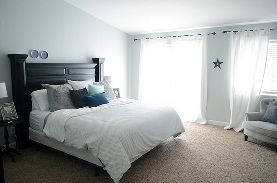
This also means we NEED a white duvet cover.

Maybe this guy?

Even the top of the dresser looks different and no, we don't have a bathroom door.
I took it off right after we moved because we couldn't fit
the nightstand and dresser and leave room for the door to swing out.
One of these days I'm going to make a sliding barn door.
One of these days.
I have three spaces for wall art and accessories and now that I've got this demanding color on the walls, I'm completely unsure about what to do. The space above the bed is not centered so putting stuff above there is tricky. I thought about playing up the off-centered-ness and putting two tiny decorations over the right side of the bed, opposite the windows.
Like this.

Could you see it?
Then there's the walls to the left and the right of the closet. I would like some function out of those spaces but the room is so teensy, I don't want it to get overwhelmed.

There's so little clearance around the bed that only the shallowest shelf would work.
If I did shelves. I just want to do something cool.

We have a big mirror that I could put here. Possibly. Maybe.
I do like how the trim looks super crisp and bright white with the new paint and the floors look warmer.

You can sorta kinda see it.

I don't know if you can tell but I promise, the new paint really makes a difference.
I've never used a deep color like this before and when I was done, I wasn't like oh my god it's perfect! It was more like damn, it's gonna take a long time to repaint this shit. Of course, it *was* two in the morning and I was exhausted. In the light of day, I'm starting to warm up to it.
Why not take a risk? Why not step outside the safe little predictable box? Why not do something unexpected?
It's only paint.
Plus, I found some inspiration pictures that make me feel like I can make this work.

I have lots of black frames that I could use to make a mini gallery.

I love the giant mirror and the white trim.

I especially love that gold coffee table.
all images houzz.com
I've never backed down from a challenge and I'm kind of excited to see what I can come up with. Maybe y'all have some pointers for me?

OMG! Love the color! Seriously, so pretty! First... I totally think that canvas set would work in there! Maybe over the bed?!?!? As for the spot by the door, I think that would be the perfect spot for a floor length mirror, and the other wall by the window could be cool with a shelf/photo wall combo... something like this?
ReplyDeletehttp://media-cache-ec2.pinterest.com/upload/154037249725256469_Vgmzdwh8_c.jpg
I think a white duvet would be AMAZING!
I'm so not a design person, but I like it! I think it is bold, while still being warm... totally a fan!
ReplyDeleteLove it! Very rich
ReplyDeleteHilarious. I just got rid of my gold (because mine truly never was the gold I had in my head) and you are going for it! Give it a week in different lighting and see how you feel. It looks nice, I just know that I am LOVING living in gray and do not miss the gold at all because it wasn't what I had imagined. So, do what you like, because living in a color you don't like for any amount of time causes a little bit of stress in the back of your mind:) I actually do like it with that beach picture. That is the picture where I liked it best! Ha. That duvet is the bomb. I owe you an email...
ReplyDeleteThis is a great representation of a word "overhaul". I really loved the paints you do here! I also got great ideas in painting houses with Denver Painting Company as well. They offer great quotes too!
ReplyDeleteLong time reader, first time commenter. I LOVE this color- so pretty. It looks awesome with your dark furniture, white trim and warm wood floors (and a white duvet would look amazing in there). I totally think those canvases would still work in the room- the wall color looks very similar to the greenery in the canvas so I totally think it would work. I hear you on the dark color painting- so much harder than a light color!! Have you considered painting the ceiling as well at all- maybe a LIGHT shade of the wall color or something complimenting? Not that the white ceiling looks bad- just an idea :) Nice work!!
ReplyDeleteI love it! And I think the beach picture could still work.
ReplyDeleteI love it, it actually reminds me of butter AND IMHO, the painting still works!
ReplyDeleteLOL! I thought I was the only one in the world that hates using the word "pop" when talking about colors that complement each other. Love the color you used in the bedroom!
ReplyDelete